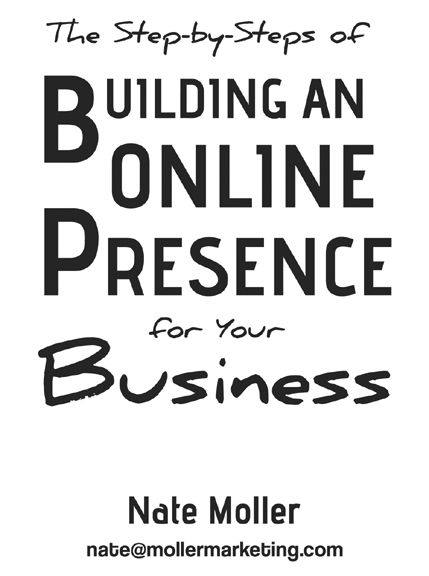
Ebook Cover Art – An Exercise in Typography
A few weeks ago, I had an assignment to create cover art for an ebook on internet marketing. The author really was only interested in typography when it came to the design. My job became using minimal design elements to create a simple yet visually catchy cover for his ebook.

Ebook Cover Art by Dean Vigyikan
Working with text is both fun and challenging. First off, one deals with the constraint that the final design must contain certain limiting elements, namely…words! The title has to say what the title says. So you might have some grandiose idea for a design structure only to find that the dimensions of the words themselves preclude carrying out your idea.Watch Full Movie Streaming Online and Download
Secondly, certain words in a title are more important than others, at least for initial impact. Obviously, in a title, the word “Business” will usually have precedence over the word, “The”. So the hierarchy of important words needs to dovetail with the composition of the design.
Thirdly, and perhaps most importantly, the choice of font styles needs to match the theme of the book, product, or article. They need to convey the feeling and attitude in which the body material was conceived. I think this is not so much a cerebral or analytical process as it is one of feeling and instinct, much like painting and other art forms. Does the text feel like it requires a modern font, and edgy one, or a casual one, or perhaps something more formal or retro in style? There are so many fonts available today, the creative possibilities are endless.
Basically, in my opinion, typography is just another expression of drawing. Perhaps comparing it with collage would be another good analogy. Just because the letter forms may have been designed by another person, doesn’t mean that composing with them is that much different from composing a picture with elements drawn by the artist him or herself.
There is definately a lot to learn about this topic. I love all of
the points you have made.
Thank you. You’re right, there’s a lot to learn about this specialized niche of design. Typography is a delicate balance of rules of thumb and gut feelings. I believe that stellar results come from striking that balance just right. Thanks again for your comment!