Typographic Art and Design: Part II
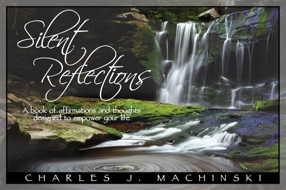
Last week’s post featured some of my musings on using typography in art projects. Now I’m posting another example because I like the way this particular font works with a cover design much different from the one posted last week.Watch Full Movie Online Streaming Online and Download

In this piece, I had the liberty of using a font whose legibility is still important, but no more important than the sweeping freedom it imparts to the cover design, as reflected by the book’s contents. The gorgeous photo by Forest Wander required that I arrange the geometric and organic components of the design so as to harmonize with it in a pleasing and hopefully inspiring way. Once again, the elements of the cover art are arranged as would be the elements of any hand-drawn piece of art. The necessary features of a figure drawing must be present and accounted for for the composition to make sense, as do the essential elements of a book cover design. In both cases the creativity comes in choosing from the myriad ways in which the appropriate visual vocabulary might be presented.